Grant figures conceptual tips
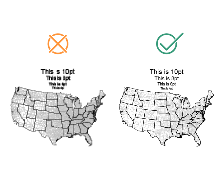
- Make sure your figures are good resolution, or vector based.
- Please don’t use screen shots for real images.
- Figures made in Power Point can look great in Word. Here is a good option for importing them as vector images. PPT isn’t my preferred tool as a professional, but it can work just fine if you import the images into Word with care.
- If you are including a conceptual flow chart, or logic-diagram-type-of-image, don’t have everything pointing at everything.
- We know all your subjects are connected, but when everything is pointing at everything, there is no real information. Have restraint.
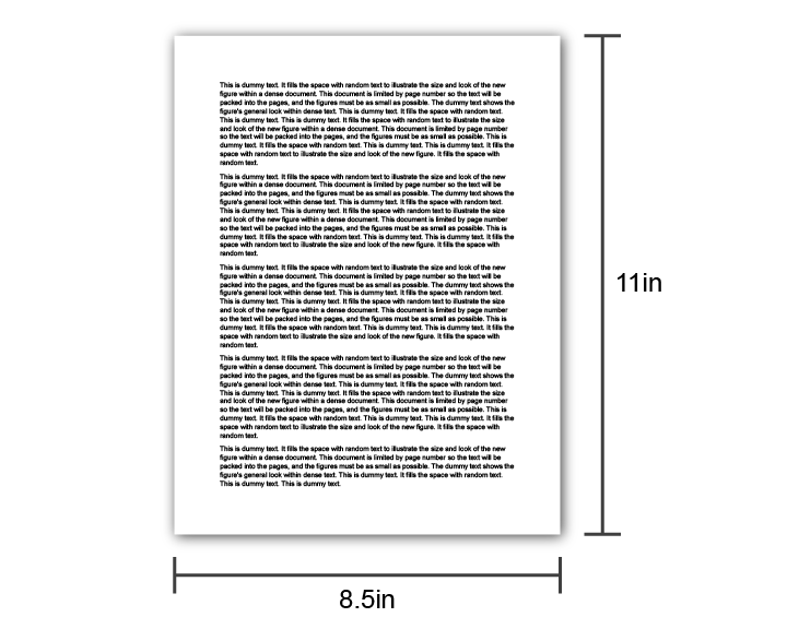
- Make the size of your canvas the real size it’s going to be in your proposal.
- Proposals are always on 8.5X11 pages with 1inh margins for NSF or 0.5in for NIH, so the widest your figure can be either 6.5in or 7.5in. Working in real-life sizes is critical to maintaining reasonable font sizes.
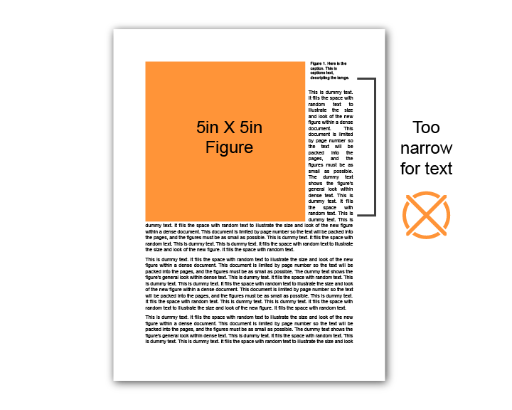
- Full-width images are great, and half-width images are great. But between 4 and 6 inches wide results in a narrow gutter for your body text.
- It can work if you put the caption on the side, or if you are willing to have white space to the side. (But strict page limits always loom large!)
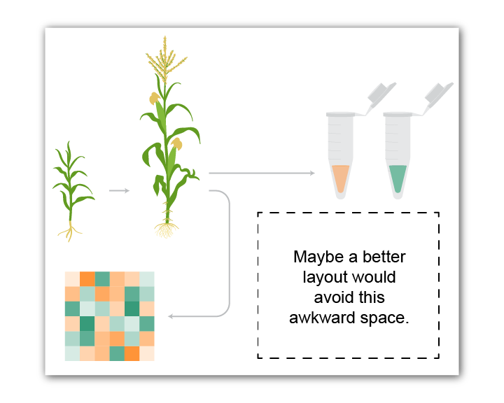
- When mocking up the layout of your image, think about those outer boundaries/edges of your image. It’s probably going to be inserted into Word as a rectangle, so if you have one component way off to the side, it’s going to make the whole image larger, and space is always at a premium.
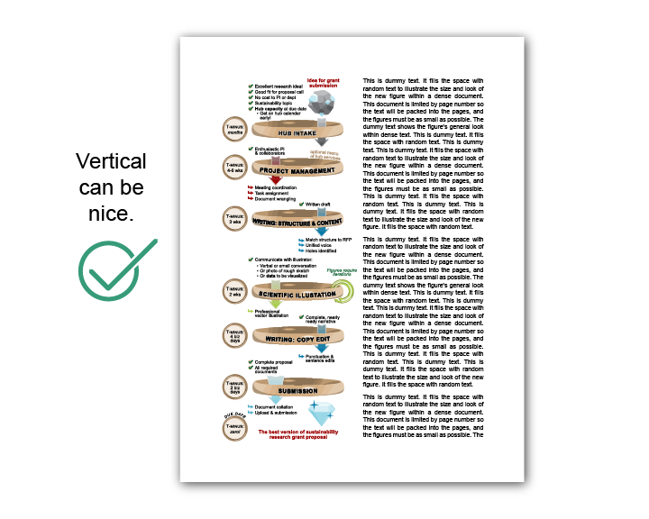
- I like the look of a thin vertical figure in a proposal.
- One possible downside is that PIs often want to recycle their images in Power Point, and a tall-thin figure isn’t so good for that.
- Choose the minimum font size you are willing to use within the figure. This might be specified by your funding agency, but often it’s not.
- 8pt is a solid choice. I often see 4pt or smaller in grants (especially graphs), but I personally won’t go smaller than 6pt. Here is a menu showing what different options look like.
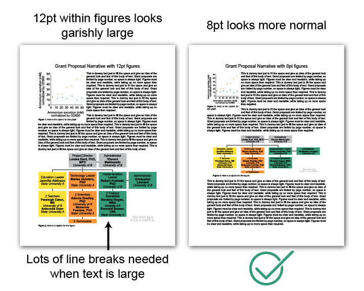
- Using 12pt+ within a figure in a grant proposal is very unusual and looks weird.
- Since you have chosen a minimum font size for your figure, use that size for almost all the text within the figure.
- If you need to create a hierarchy of text, bold or underlining is a nice option. You can also use larger font size for the title, but often space is at a premium, and we have established that your minimum is perfectly readable.
- For typeface, I generally stick to Arial. If you use the default font du jour in Microsoft, it’s a sign that you made it in power point. Not a big deal, but Arial is fairly timeless at this point and never looks out of place.
- Contrast and color are tools. Use them judiciously. If you use high-contrast, jarring colors everywhere, then you’ve wasted one of your best tools.
- It's like how if you write an entire email in all caps, then you can’t use capital letters to emphasize your MOST IMPORTANT POINT. Have restraint.
- Instead of using random colors, do consider using a unified color theme to add to the professionalism of your figures.
- I starting putting some color themes for diagrams together.
- There are many theories of color themes, but the easiest option is just to google, "color themes."
- I also like to use Coolers, and the Color Guide built into Adobe Illustrator.
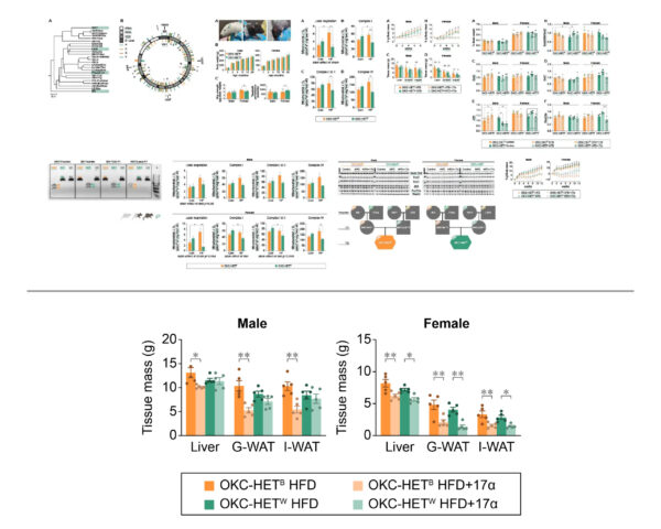
- Use the same colors for each item throughout all the figures in your grantpaper.
- Having the same item always be the same color will help your readers tremendously, and also make your project seem more professional and polished.
- (I drew these figures for this paper. )
- One of your first questions when picking colors for a scientific diagram is how many distinct colors do you specifically need for your content.
- For example, is it a figure about the effects of 3 drugs, or levels of 1 compound, or 4 measurements, etc.
- Generally, either text or it's background should be neutral black or white.
- Don't use colors for both text and the background unless you have a special reason.
- Text should meet a minimum contrast level with the background color in order to be considered 'readable.'
- The WCAG AA contrast level is the standard.
- Generally, every color is either acceptable for black or white text, but not both.
- If you are making a figure showing the effects of 3 treatments shown as 3 colors, use 3 colors of similar darkness so that you can use the same color of text (either white or black) on all three.
- If your items are equally related to each other, then don't have two of the colors really similar and one outlier.
- Red/Green deuteranopia is the most common form of color blindness, so never do a red/green heat map. You can simulate it here.
- There are many other forms of color blindness too, so try to also use other indicators like labels and shapes to distinguish the items in your diagram.
- Having items mis-colored in extreme ways and illicit the Stroop Effect and make your data very hard to interpret.
- Pick colors that intuitive for your readers, but don't be rude or offensive.
- If two of your items are more related than the others, consider giving them colors that are more similar to each other.
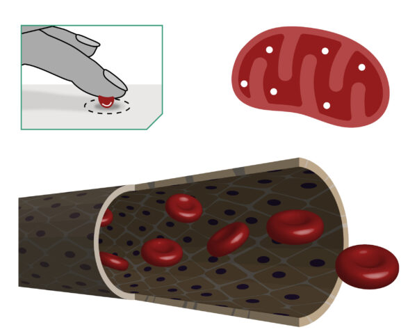
- Some things in scientific illustrations have to be a certain color. Do your readers a favor and stick to what they expect.
- For example, mitochondria are inexplicably always shown as red. They don't need to be firetruck red, but people expect them to be at least redish.